

Web development transforms creative visions into functional digital experiences. While web design focuses on aesthetics and user experience, web development brings those designs to life through code, creating websites that not only look stunning but perform flawlessly across all devices and platforms.
Modern web development requires a strategic blend of technical skills and design sensibility. Developers must understand how visual elements translate into code, optimize for performance, and ensure accessibility while maintaining the designer’s original vision. This comprehensive guide explores the essential web development concepts that bridge the gap between beautiful designs and robust, functional websites.
From responsive frameworks to performance optimization, you’ll discover the technical foundations that make great web design possible. Whether you’re a designer learning to code or a developer refining your skills, understanding these core principles will help you create websites that excel in both form and function.
Foundation Technologies for Modern Web Development

HTML: The Structural Backbone
HTML provides the semantic structure that gives meaning to your content. Modern web development emphasizes semantic HTML5 elements that clearly describe content’s purpose rather than just appearance. Use <header>, <nav>, <main>, and <footer> elements to create a logical page structure.
Proper HTML structure improves accessibility and search engine optimization. Screen readers rely on semantic elements to navigate content effectively. Search engines use HTML structure to understand content hierarchy and relevance.
Clean, well-organized HTML makes your code easier to maintain and debug. Use consistent indentation and commenting to keep your markup readable. Validate your HTML regularly to catch errors that could cause display issues across different browsers.
CSS: Bringing Design to Life
CSS transforms basic HTML into visually appealing layouts. Modern CSS includes powerful features like Flexbox and Grid that simplify responsive design. Flexbox excels at one-dimensional layouts, while Grid handles complex two-dimensional arrangements.
Organize your CSS with methodologies like BEM (Block Element Modifier) or SMACSS (Scalable and Modular Architecture for CSS). These approaches create maintainable stylesheets that scale with your project size. Use CSS custom properties (variables) to maintain consistency across your color palette, typography, and spacing.
CSS preprocessors like Sass or Less add programming features to your stylesheets. Variables, mixins, and functions reduce code repetition and make global changes easier. However, many features that once required preprocessors are now available in native CSS.
JavaScript: Interactive Functionality
JavaScript adds interactivity and dynamic behavior to websites. Modern JavaScript (ES6+) includes features like arrow functions, template literals, and modules that make code more readable and maintainable.
Focus on progressive enhancement—ensure your site works without JavaScript, then layer on enhanced functionality. This approach improves accessibility and provides fallbacks for users with JavaScript-disabled or slow connections.
Use JavaScript frameworks and libraries judiciously. While tools like React, Vue, or Angular can speed development, they add complexity and file size. Simple sites might benefit more from vanilla JavaScript or lightweight libraries.
Responsive Web Development Strategies
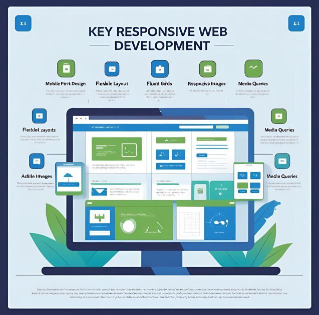
CSS Grid and Flexbox for Adaptive Layouts
CSS Grid revolutionizes how developers create responsive layouts. Define grid templates that automatically adjust based on screen size using features like repeat(auto-fit, minmax()). This approach eliminates the need for complex media queries in many cases.
Flexbox handles component-level layouts within grid containers. Use Flexbox for navigation menus, card layouts, and form elements. The combination of Grid for page structure and Flexbox for components creates flexible, maintainable layouts.
Container queries, now supported in modern browsers, allow components to respond to their container size rather than viewport dimensions. This enables truly modular design systems where components adapt based on available space.
Progressive Web App Features
Service workers enable offline functionality and push notifications. Register a service worker to cache critical resources and provide basic functionality when users lose internet connection. This dramatically improves user experience, especially on mobile devices.
Web app manifests make websites installable on mobile devices. Users can add your site to their home screen and launch it like a native app. Include proper icons, theme colors, and display modes to create app-like experiences.
Progressive Web Apps (PWAs) bridge the gap between web and mobile apps. They load fast, work offline, and provide native-like experiences while maintaining web accessibility and cross-platform compatibility.
Performance Optimization Techniques
Image optimization significantly impacts loading speed. Use modern formats like WebP or AVIF when supported, with fallbacks for older browsers. Implement lazy loading for images below the fold to reduce initial page load time.
Code splitting divides JavaScript into smaller chunks that load only when needed. This reduces initial bundle size and improves perceived performance. Use dynamic imports to load functionality on demand.
Critical CSS inlining embeds above-the-fold styles directly in HTML to eliminate render-blocking resources. Extract and inline only the CSS needed for the initial page render, then load the remaining styles asynchronously.
Backend Integration and Dynamic Content
API Integration and Data Management
RESTful APIs provide structured ways to exchange data between frontend and backend systems. Use HTTP methods appropriately: GET for retrieving data, POST for creating resources, PUT for updates, and DELETE for removal.
Asynchronous JavaScript (async/await) handles API calls without blocking user interactions. Implement proper error handling and loading states to communicate with users during data operations. Cache API responses when appropriate to reduce server load and improve performance.
GraphQL offers an alternative to REST APIs with more flexible data fetching. Clients specify exactly what data they need, reducing over-fetching and under-fetching issues common with REST endpoints.
Content Management System Integration
Headless CMS architectures separate content management from presentation. Systems like Contentful, Strapi, or Sanity provide content APIs that developers can integrate with any frontend framework.
Static site generators combine the benefits of dynamic content with static site performance. Tools like Gatsby, Next.js, or Nuxt.js generate static HTML at build time while maintaining dynamic capabilities where needed.
JAMstack architecture (JavaScript, APIs, and Markup) creates fast, secure, and scalable websites. Pre-built markup serves from CDNs while dynamic functionality relies on APIs and client-side JavaScript.
Testing and Quality Assurance
Cross-Browser Compatibility
Browser testing ensures consistent experiences across different platforms. Use tools like BrowserStack or CrossBrowserTesting to test on real devices and browsers. Pay special attention to Safari on iOS and older versions of Internet Explorer if your audience requires support.
Feature detection with libraries like Modernizr provides graceful degradation for unsupported features. Test for capability rather than specific browser versions to create more robust code.
Progressive enhancement strategies ensure basic functionality works everywhere while enhanced features activate on capable browsers. This approach creates resilient websites that adapt to user capabilities.
Performance Testing and Monitoring
Lighthouse audits provide comprehensive performance analysis, including loading speed, accessibility, best practices, and SEO. Run audits regularly during development to catch issues early.
Real User Monitoring (RUM) tracks actual user experiences rather than lab conditions. Tools like Google Analytics or specialized services provide insights into how real users experience your site’s performance.
Core Web Vitals measure user-centric performance metrics including loading speed, interactivity, and visual stability. These metrics directly impact search rankings and user satisfaction.
Accessibility Testing
Screen reader testing ensures your site works for visually impaired users. Use tools like NVDA or JAWS to experience your site as assistive technology users would. Test keyboard navigation to ensure all functionality remains accessible.
Automated accessibility testing catches common issues but can’t replace manual testing. Tools like Axe or WAVE identify technical violations, but human testing reveals usability issues that automated tools miss.
Color contrast analysis ensures text remains readable for users with visual impairments. Use tools like WebAIM’s contrast checker to verify your color combinations meet WCAG guidelines.
Deployment and Maintenance
Version Control and Collaboration
Git version control enables collaborative development and provides safety nets for code changes. Use branching strategies that match your team size and deployment process. Feature branches keep experimental work separate from stable code.
Code review processes catch bugs and improve code quality. Use pull requests to discuss changes before merging. Establish coding standards and use linters to maintain consistency across team members.
Continuous Integration (CI) automatically tests code changes and catches issues before deployment. Set up automated testing, linting, and build processes to maintain code quality.
Hosting and Domain Management
Choose hosting solutions that match your technical requirements and traffic expectations. Shared hosting works for simple sites, while VPS or dedicated servers provide more control for complex applications.
Content Delivery Networks (CDNs) improve loading speeds by serving files from locations closer to users. Services like Cloudflare or AWS CloudFront also provide security features and caching optimization.
SSL certificates encrypt data transmission and improve search rankings. Let’s Encrypt provides free certificates that most hosting providers can install automatically.
Ongoing Optimization and Updates
Regular updates keep your site secure and performing well. Update content management systems, plugins, and dependencies to patch security vulnerabilities and access new features.
Performance monitoring identifies optimization opportunities over time. Track loading speeds, error rates, and user behavior patterns to prioritize improvements that benefit your specific audience.
A/B testing compares different versions of design elements to optimize conversion rates. Test headlines, button colors, or layout changes to make data-driven improvement decisions.
Mastering the Development Process
Web development excellence comes from understanding both the technical implementation and the user experience goals. The most successful developers think beyond code syntax to consider how their technical decisions impact real users navigating real-world scenarios.
Start each project with a clear understanding of user needs and business objectives. Technical solutions should solve specific problems rather than showcase the latest technologies. Choose tools and frameworks that match project requirements, not personal preferences.
Build incrementally and test frequently. Deploy small changes regularly rather than large updates that introduce multiple potential failure points. This approach makes debugging easier and reduces the risk of breaking existing functionality.
The web development landscape evolves rapidly, but fundamental principles remain constant. Focus on creating fast, accessible, and maintainable code that serves users effectively. Stay curious about new technologies while maintaining a solid foundation in core web standards.


