

This blog explores Top Web Design Trends shaping modern websites, including purposeful minimalism, dark mode, organic shapes, micro-interactions, lightweight 3D elements, accessibility-first design, and AI-powered workflows. It highlights how these trends improve user experience, performance, and engagement while helping businesses build future-ready, visually compelling, and highly functional digital experiences.
Purposeful Minimalism and Dark Mode

Minimalism with Intention
One of the most enduring web design trends centers on thoughtful minimalism. Rather than simply removing visual clutter, designers are refining every component on the page to serve a clear purpose. Generous whitespace helps draw attention to essential content blocks, while concise navigation structures eliminate frustration and guide users toward desired actions. This approach not only enhances readability but also accelerates page load speeds by reducing unnecessary assets. Streamlined typography, featuring bold headings and easily scannable body text, further reinforces hierarchy and call-to-action emphasis. As you craft minimalist layouts, focus on eliminating distractions and leveraging contrasting colors or sizing to spotlight key elements such as buttons, forms, and imagery.
Dark Mode and Theme Toggling
Complementing minimalist designs, dark mode toggles have become a must-have feature. Allowing visitors to switch between light and dark themes on the fly boosts comfort—particularly during evening browsing sessions or in low-light environments. This dual-theme strategy also extends battery life on devices with OLED screens, contributing to improved user satisfaction. From an aesthetic standpoint, dark mode lends a sleek, modern feel that aligns well with minimalist interfaces. When implementing theme switching, ensure that contrast ratios remain accessible and that color palettes adapt gracefully to both environments. Providing a persistent toggle—either in a header toolbar or within user settings—empowers your audience to tailor the experience to their preferences while reinforcing your site’s commitment to user-centric design.
Ensuring proper implementation often requires knowledge of core styling systems like CSS fundamentals in web development, especially when managing theme variables and responsive color systems.
Organic Shapes and Fluid Interfaces
Leveraging Natural Geometry
Breaking away from rigid grids, designers are embracing organic shapes and asymmetrical layouts to inject personality into websites. Curved sections, irregular geometric patterns, and overlapping elements create dynamic visual narratives that guide the eye and reinforce branding identity. Scalable Vector Graphics (SVGs) play a pivotal role in this trend, offering crisp rendering at any resolution without burdening page weight. By layering SVG shapes with controlled z-index values, you can add depth and dimensionality without compromising performance. Fluid layouts that adapt to viewport changes further enhance the sense of motion and engagement, ensuring that design elements flow seamlessly from mobile to desktop.
Fluid interfaces also benefit from interactive logic powered by JavaScript fundamentals for beginners, enabling motion, transitions, and dynamic layout behavior.
Balancing Fluidity with Usability
While experimental compositions capture attention, it’s important to maintain usability by anchoring key sections with enough whitespace. Striking a balance between eye-catching geometry and clear content areas prevents users from feeling overwhelmed. Grid-based underpinnings can still operate behind the scenes, allowing you to align text and interactive components consistently. Paired with intentional typography choices and a coherent color scheme, organic shapes elevate the user experience without sacrificing clarity. As you explore fluid interfaces, test across multiple devices to confirm that dynamic elements enhance rather than hinder navigation and comprehension.
Micro-Interactions and Lightweight 3D Elements
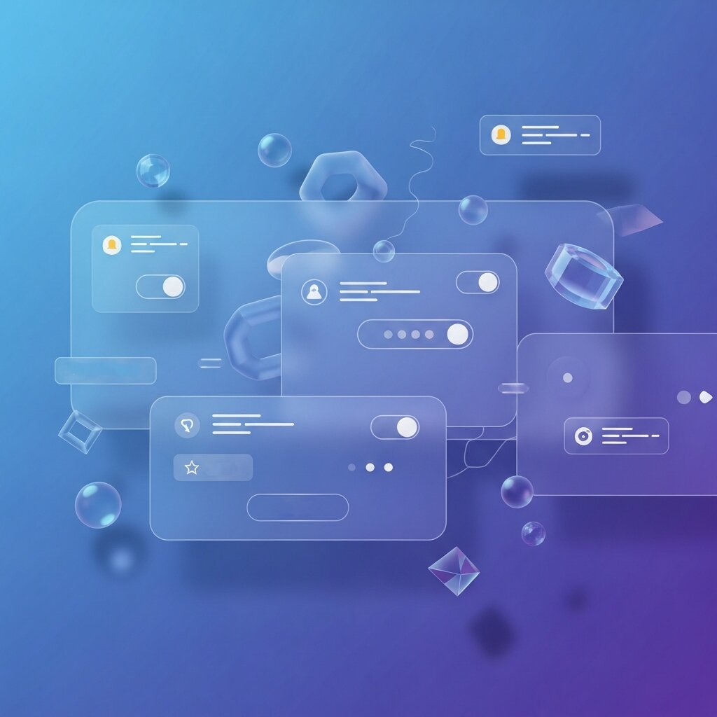
Implementing Seamless Micro-Interactions
Subtle animations can provide critical feedback and delight users as they interact with your site. Micro-interactions—such as button hover effects, input field highlights, or scroll-based progress indicators—signal responsiveness and guide behavior. To preserve snappy performance, keep animation durations under 300ms and offer reduced-motion alternatives for visitors with vestibular sensitivities. Use CSS transitions or lightweight JavaScript libraries to manage micro-interactions, ensuring that they feel smooth without overtaxing the browser. By thoughtfully applying these small moments of interactivity, you reinforce user confidence and inject personality into otherwise static pages.
Integrating Lightweight 3D Visuals
Advances in WebGL and compression techniques now make it possible to incorporate 3D models and parallax layers without crippling load times. When executed with restraint, subtle 3D elements can bring product showcases, illustrations, or data visualizations to life. Aim to optimize model complexity by reducing polygon counts and simplifying textures. Lazy-load 3D assets so they appear only when needed, and provide fallbacks—such as static images or CSS-based parallax effects—on devices that lack WebGL support. This hybrid strategy ensures a broad reach while delivering an immersive experience for those with capable hardware.
Accessibility, Performance, and Compliance

Prioritizing Inclusive Web Standards
Leading sites now integrate semantic HTML elements and ARIA attributes to make content perceivable and operable for users with disabilities. Ensure that all interactive components are reachable via keyboard navigation and that color contrast ratios meet or exceed WCAG 2.1 guidelines. Regular audits—using tools like WAVE, Axe, or Lighthouse—help identify barriers and maintain compliance over time. For authoritative guidance, reference the W3C Web Accessibility Initiative (WAI) and the U.S. government’s Section508.gov portal (Section508.gov).
Ensuring Speed and Efficiency
Performance optimization goes hand in hand with accessibility, as fast-loading pages benefit all users. Compress images with modern formats like WebP or AVIF, and leverage lazy loading to delay offscreen media. Employ code-splitting and tree shaking to reduce JavaScript payloads, and consider server-side rendering (SSR) or static site generation (SSG) to pre-render content efficiently. Caching strategies—both at the browser level and via Content Delivery Networks (CDNs)—help deliver assets swiftly across geographies. By combining inclusive design with high-performance techniques, you create a website that delights every visitor and ranks favorably in search engines.
Speed optimization also plays a major role in emerging architectures like Jamstack for high-performance websites, where static generation and CDN delivery improve global load times.
AI-Powered Tools and Future-Proof Workflows
AI for Design Inspiration and Productivity
Artificial intelligence has emerged as an invaluable assistant for modern web designers. Tools like ChatGPT can generate copy, suggest color palettes, and even produce CSS snippets on demand. AI-driven pattern libraries analyze your brand’s existing assets to recommend layout structures, accelerating the prototyping phase. Image background removers and automatic asset optimizers save hours of manual editing, letting you focus on high-level creative decisions. While AI won’t replace human intuition, it streamlines repetitive tasks and surfaces fresh ideas—empowering teams to experiment and iterate more quickly.
Building Scalable, Responsive Frameworks
As you adopt AI-enhanced workflows, it’s important to establish a foundation that can evolve alongside future web design trends. Develop a robust design system with reusable components and clear style guidelines. Leverage CSS custom properties and utility-first frameworks to adjust visual schemes without rewriting core code. Integrate version control and design tokens to maintain consistency across projects. By creating a modular, responsive infrastructure, your website remains agile as new innovations emerge, ensuring longevity and adaptability in an ever-changing digital realm.
Voice User Interface (VUI) Integration
Voice search and voice commands are becoming a major part of modern web experiences, changing the way users interact with digital platforms. Websites are now being optimized not only for text-based navigation but also for spoken queries, allowing users to find information, complete actions, and navigate pages hands-free. Integrating VUI significantly improves usability for mobile users, especially in situations where typing is inconvenient or impossible. It also enhances accessibility for people with disabilities, making digital content more inclusive. As smart assistants like Alexa, Siri, and Google Assistant continue to grow in popularity, designing for voice interaction is quickly becoming an essential component of future-ready web design strategies.
Immersive Scrolling Experiences (Parallax & Scroll Effects)
Modern websites are increasingly using scroll-based animations to create immersive, story-driven experiences that guide users through content in a more engaging way. Parallax effects, smooth animated transitions, and scroll-triggered content blocks add depth and motion to otherwise static pages. These techniques help designers build a narrative flow, where each scroll reveals new layers of information in a visually appealing sequence. When implemented carefully, these effects significantly increase user engagement and encourage longer time spent on site. However, maintaining balance is key—overusing animations can distract or slow down the experience, so performance optimization and subtle design choices are essential.
Mobile-First and Responsive Design Evolution
With mobile traffic now dominating global web usage, mobile-first design has become the foundation of modern web development. Designers prioritize small-screen experiences first, ensuring that core content, navigation, and functionality work seamlessly on mobile devices before scaling up to larger screens like tablets and desktops. Responsive layouts automatically adapt to different screen sizes and resolutions, creating a consistent experience across all devices. This approach not only improves usability but also plays a major role in SEO performance, as search engines prioritize mobile-friendly websites. Additionally, optimized mobile experiences often lead to higher conversion rates and better user retention.
Data Visualization and Interactive Dashboards
As digital platforms handle increasingly large and complex datasets, data visualization has become a critical part of modern web design. Instead of presenting raw numbers, websites now use interactive charts, graphs, maps, and dashboards to transform data into visually engaging and easy-to-understand formats. Users can explore information dynamically, filter results, and gain insights in real time. This trend is especially important for SaaS platforms, analytics tools, fintech applications, and enterprise systems where quick decision-making depends on clear data interpretation. Well-designed visualizations not only improve comprehension but also enhance user engagement and trust in the platform.
FAQ
What is purposeful minimalism in web design?
Purposeful minimalism focuses on refining every element on the page to serve a clear function, using whitespace, streamlined typography, and concise navigation to highlight key content and improve readability.
How can I ensure my site remains accessible to all users?
Implement semantic HTML and ARIA attributes, maintain high color contrast, enable keyboard navigation, and conduct regular audits with tools like WAVE, Axe, or Lighthouse to identify and fix accessibility barriers.
When should I integrate 3D elements into my design?
Use lightweight 3D visuals sparingly for product showcases or interactive illustrations. Optimize models, lazy-load assets, and provide fallbacks to ensure broad compatibility and fast performance.
Conclusion
Mastering today’s top web design trends demands a harmonious blend of simplicity, interactivity, accessibility, and forward-thinking strategy. By embracing purposeful minimalism, dark mode toggling, organic shapes, micro-interactions, lightweight 3D elements, and an accessibility-first approach, you lay the groundwork for engaging, high-performing sites. Supplement these best practices with AI-powered tools and scalable frameworks to streamline workflows and prepare for future innovations. In today’s competitive environment, applying these web design trends can help your brand stand out, foster user loyalty, and support long-term growth. Start integrating these techniques into your projects now to deliver exceptional digital experiences that captivate and convert your audience.


