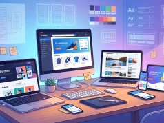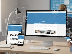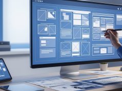
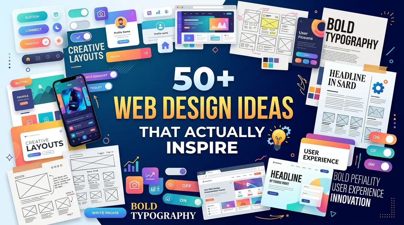
Great web design combines creativity, modern UI/UX trends, responsive layouts, strong visuals, and user-focused experiences. By applying effective design principles like clear navigation, engaging interactions, and mobile optimization, businesses can create websites that attract visitors, improve usability, and drive better results.
Web design inspiration comes from studying modern UI/UX trends, exploring creative layouts, and applying best practices like responsive design, bold typography, and whitespace. The most effective websites balance aesthetic appeal with user-friendly functionality—drawing ideas from design galleries, competitor sites, and emerging trends in motion, color, and interactivity.
Great web design doesn’t happen by accident. Behind every site that stops you mid-scroll is a series of deliberate decisions—about layout, color, typography, animation, and the invisible logic that makes a page feel intuitive. Whether you’re redesigning an existing site or building from scratch, the hardest part is often knowing where to start.
This post collects the best web design ideas across every major category: creative concepts, modern UI/UX inspiration, innovative trends, layout strategies, and user-friendly principles. By the end, you’ll have a clear picture of what separates a forgettable website from one that people actually remember—and share.
What Makes a Web Design Truly Creative?
Creativity in web design isn’t about being different for the sake of it. The most creative websites solve real problems in visually compelling ways. They guide the eye, reduce friction, and leave a lasting impression—all at once.
Understanding the foundation of modern web design trends and best practices can help designers create experiences that are visually appealing while maintaining usability and performance.
Some hallmarks of genuinely creative web design:
- Unexpected layouts that break the grid without sacrificing readability
- Micro-interactions that reward curiosity (hover effects, animated buttons, scroll-triggered reveals)
- Strong visual hierarchy that directs attention without the user realizing it
- Personality-driven typography that communicates brand identity before a single word is read
Creativity works best when it’s grounded in purpose. Ask yourself: what do I want users to feel when they land on this page? Energized? Trusted? Intrigued? Let the answer guide your creative choices.
Modern Website Design Inspiration: What Are the Best Sites Doing Right Now?
Modern web design has moved away from cluttered, information-dense pages toward clarity, speed, and meaningful interaction. Here’s what the best modern sites prioritize:
Bold, Oversized Typography
Large headlines are having a moment—and for good reason. When text is big enough to function as a visual element, it eliminates the need for complex imagery. Brands like Arc Browser and Linear use massive, confident type to establish authority immediately.
Typography should not only look attractive but also support readability and user experience. Designers exploring complete web design principles and techniques can better understand how fonts, spacing, and hierarchy influence visitor behavior.
Dark Mode and Duotone Color Schemes
Dark backgrounds with high-contrast accents create a premium, focused feel. Duotone palettes—where two colors dominate the entire visual system—add cohesion and memorability. Both approaches reduce visual noise and keep attention on what matters.
Glassmorphism and Soft UI
Frosted-glass effects and soft, pastel-heavy interfaces give digital products a tactile, almost physical quality. These styles work especially well for SaaS dashboards, fintech apps, and health-related platforms where trust and calm are priorities.
Immersive Scroll Experiences
Scroll-triggered animations, parallax effects, and full-screen transitions transform passive reading into active exploration. Apple’s product pages remain the gold standard here—each scroll reveals something new, building desire with every frame.
Innovative Web Design Trends Worth Adopting
Not every trend deserves space on your site, but the following have demonstrated real staying power:
AI-Generated Visuals and Dynamic Content
More sites are integrating AI-generated imagery and personalized content blocks that adapt based on user behavior. This creates a sense of relevance that static designs simply can’t match.
Keeping up with broader web technology trends shaping modern websites helps businesses understand which innovations can improve engagement, personalization, and user experience.
Bento Grid Layouts
Inspired by the Japanese bento box, this layout organizes content into a modular grid of varying-sized cards. It’s clean, flexible, and excellent for showcasing multiple features or products without overwhelming the viewer. Tools like Framer and Webflow have made bento grids significantly easier to build without code.
Typographic Animation
Animated text—letters that reveal themselves, words that morph, headlines that react to cursor movement—adds energy to a page without the load-time cost of video. Studios like Resn and Locomotive have pushed this trend into genuinely artistic territory.
Minimalism With Maximum Impact
Stripped-back design isn’t about removing personality—it’s about removing distraction. White space, single-color palettes, and restrained navigation can make a site feel more premium than one packed with visual elements. Notion and Dropbox both use this approach effectively.
Website Layout Ideas: How Should You Structure a Page for Maximum Impact?
Layout determines how users move through your content. A well-structured page pulls visitors from headline to call-to-action with minimal resistance. Here are the layout ideas that consistently perform:
The Inverted Pyramid
Lead with the most important information. Put your value proposition front and center, then layer in supporting details below. This mirrors how people actually read online—skimming first, reading second.
Asymmetrical Layouts
Breaking symmetry draws attention and adds dynamism. Place a large image on one side, text on the other, and let the imbalance create visual tension that keeps the eye moving. Used thoughtfully, asymmetry signals confidence.
Card-Based Layouts
Cards are endlessly flexible. They work for blog previews, product listings, team bios, and feature comparisons. Each card functions as a self-contained unit, making them perfect for responsive design.
Split-Screen Designs
A 50/50 split serves audiences with distinct entry points—perhaps a “for businesses” and “for individuals” split, or a product demo on one side and a sign-up form on the other. It’s a simple layout that communicates choice instantly.
Sticky Navigation
A navigation bar that remains visible as users scroll reduces bounce rates by making it easy to explore other sections. Pair it with a subtle scroll-progress indicator for an extra layer of user-friendliness.
Responsive Web Design: What Are the Best Practices for Mobile-First Layouts?
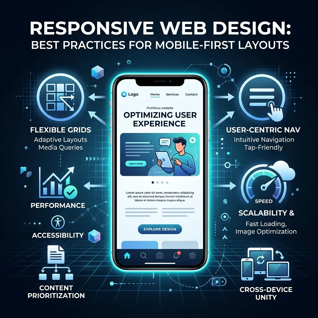
Responsive design is non-negotiable. According to Statista, mobile devices account for more than half of global web traffic. A site that breaks on smaller screens loses visitors—and conversions—fast.
Start With the Smallest Screen
Design for mobile first, then scale up. This forces prioritization: if it doesn’t fit on a 375px screen, does it really need to be there at all?
Use Fluid Typography
Rather than setting fixed font sizes, use CSS clamp() or viewport-relative units to let type scale smoothly across screen sizes. This eliminates awkward size jumps between breakpoints.
Touch-Friendly Targets
Buttons and links on mobile need to be at least 44×44 pixels—Apple’s recommended minimum touch target size. Anything smaller frustrates users and increases error rates.
Prioritize Loading Speed
Google’s Core Web Vitals measure real-world performance, and they directly influence search rankings. Compress images, defer non-critical JavaScript, and use next-gen formats like WebP. A responsive design that loads slowly is still a poor user experience.
User-Friendly Web Design Ideas: How Do You Design for Real People?
Good UX design makes the right action obvious. Here’s how to apply that principle across your site:
- Reduce cognitive load: Present one primary action per page section. Too many choices paralyze users.
- Use familiar patterns: Navigation at the top, logo top-left, contact in the footer. Deviating from convention requires a compelling reason.
- Write for skimmers: Short paragraphs, bullet points, and descriptive subheadings let users extract value without committing to a full read.
- Design for accessibility: Use sufficient color contrast (WCAG recommends a minimum ratio of 4.5:1 for normal text), add alt text to images, and ensure keyboard navigation works throughout.
- Test with real users: Heatmaps, session recordings, and A/B testing tools like Hotjar and VWO reveal where users struggle—insights that no amount of design intuition can replace.
Professional Website Design Inspiration: What Do High-Converting Sites Have in Common?
Professional doesn’t mean boring. The best professional sites combine credibility with energy. Here’s what they consistently get right:
Social Proof Woven Throughout
Testimonials, client logos, case study snippets, and review scores aren’t confined to a single page—they appear at the exact moments users might hesitate. This timing matters more than quantity.
Clear, Action-Oriented CTAs
“Get started,” “See it in action,” “Try for free”—the best CTAs are specific, low-commitment in language, and visually prominent. Avoid vague prompts like “Learn more” when a specific action is possible.
Consistent Brand Identity
Color palette, font choices, illustration style, and photography direction should feel unified across every page. Inconsistency signals disorganization—and users notice, even if they can’t articulate why.
Fast, Frictionless Forms
Every additional field in a form reduces completion rates. Ask for only what you genuinely need at each stage. Progressive disclosure—revealing fields gradually—can reduce perceived effort significantly.
Unique Website Design Concepts to Set Your Site Apart
Looking to stand out? These design concepts are less common and more memorable:
- Cursor customization: Replace the default cursor with something branded or contextual. Subtle, but surprising.
- Horizontal scrolling sections: Used sparingly, horizontal scroll creates a gallery or timeline effect that feels cinematic.
- Illustrated interfaces: Custom illustrations replace generic stock photos, adding warmth and distinctiveness that photography rarely achieves.
- Interactive product showcases: 3D product viewers, configurators, and interactive demos let users engage with a product before buying. Shopify merchants using 3D models have reported significant increases in conversion rates.
- Sound design: Ambient audio or subtle interaction sounds (opt-in only) can create an atmosphere that visual design alone cannot.
Modern UI/UX Design Ideas: How Do Interface and Experience Work Together?
UI (user interface) and UX (user experience) are often treated as separate disciplines, but the most effective designs treat them as inseparable. The interface is the experience.
Design Systems Over One-Off Decisions
Building a design system—a library of reusable components, tokens, and guidelines—ensures consistency at scale. Tools like Figma, Storybook, and Zeroheight make design systems accessible even to small teams.
Empty State Design
Empty states (what users see when there’s no content yet) are often neglected. A well-designed empty state with a helpful prompt or illustration transforms a frustrating moment into a guiding one.
Onboarding Flows
First impressions in software are everything. A great onboarding flow reduces time-to-value—the moment a user first experiences the benefit of your product. Progress indicators, tooltips, and contextual prompts all shorten that gap.
Feedback and Confirmation
Every action should have a reaction. Saved a form? Show a confirmation. Made an error? Explain it clearly and offer a path forward. Small feedback moments build trust over time.
Build Something Worth Bookmarking
The web is full of forgettable sites. What separates the memorable ones isn’t budget or team size—it’s intention. Every layout choice, color decision, and interaction detail communicates something. The designers behind the sites that inspire us understood this deeply.
Start by identifying one section of your current site that frustrates you, confuses users, or simply feels outdated. Apply one idea from this post. Test it. Measure it. Then move to the next.
Great web design is cumulative. Each improvement compounds, and eventually you end up with something people screenshot, share, and return to.
Frequently Asked Questions
What are the best sources of web design inspiration?
The most reliable sources include Dribbble, Behance, Awwwards, and Mobbin for UI patterns. Studying sites in adjacent industries—not just direct competitors—often yields the freshest ideas. Browser extensions like Page Flows capture full-page screenshots for easy reference.
What is the difference between UI design and UX design in web projects?
UI design focuses on the visual layer—what users see, including colors, typography, buttons, and layout. UX design addresses how users move through a product and whether that journey feels logical and satisfying. Effective web design requires both to work in alignment.
How do I make my website design more user-friendly?
Reduce the number of choices on each page, use familiar navigation patterns, write in plain language, and test your site with real users using tools like Maze or UsabilityHub. Accessibility improvements—like sufficient color contrast and keyboard navigation—also significantly improve usability for all visitors.
What is a bento grid layout in web design?
A bento grid layout organizes content into a modular grid of varying-sized rectangular cards, inspired by the compartmentalized Japanese bento box. It’s particularly effective for displaying multiple features or product highlights in a visually balanced, scannable way.
How important is responsive design for SEO?
Responsive design is a confirmed ranking factor for Google. Google uses mobile-first indexing, meaning it primarily crawls and evaluates the mobile version of a site. A non-responsive design directly harms search visibility, user experience, and conversion rates.
What makes a website design look professional?
Professional web design typically combines consistent brand identity, clean typography, fast load times, clear calls-to-action, and social proof. Professionalism is often communicated through what’s removed—unnecessary animations, cluttered navigation, and inconsistent styling all undermine credibility.
How do I choose the right color palette for my website?
Start with your brand’s core color and build outward. Use a primary color for CTAs and key elements, a neutral for backgrounds and body text, and an accent for highlights. Tools like Coolors and Adobe Color can generate harmonious palettes. Always test contrast ratios against WCAG accessibility standards.
Where can I find the best web design inspiration?
The best sources for web design inspiration include platforms like Dribbble, Behance, Awwwards, Mobbin, and website galleries. Studying modern websites and competitor designs can also help generate new ideas.
What makes a website design creative and effective?
A creative website design combines unique layouts, strong visual hierarchy, engaging interactions, attractive typography, and smooth user experiences while still making it easy for visitors to find information.
What are the latest web design trends?
Popular web design trends include bold typography, dark mode designs, bento grid layouts, AI-generated visuals, immersive scrolling, micro-interactions, minimalism, and personalized user experiences.
Why is responsive web design important?
Responsive web design ensures a website works properly across desktops, tablets, and mobile devices. It improves user experience, supports SEO performance, and helps businesses reach more visitors.
How can I make my website design more user-friendly?
You can improve website usability by simplifying navigation, reducing clutter, using clear calls-to-action, optimizing page speed, improving accessibility, and testing designs with real users.
What is the difference between UI design and UX design?
UI design focuses on the visual elements of a website, including colors, typography, buttons, and layouts. UX design focuses on the overall user journey, usability, and how easily visitors complete their goals.
How do I choose the right website layout?
Choose a website layout based on your goals, audience, and content structure. Popular layouts include card-based designs, split-screen layouts, asymmetrical layouts, and inverted pyramid structures.
How does typography affect web design?
Typography influences readability, brand identity, and user perception. Using the right fonts, sizes, spacing, and hierarchy helps guide visitors through content and improves overall website experience.
What are the most important elements of professional web design?
Professional websites usually include consistent branding, fast loading speeds, clear navigation, mobile optimization, strong visuals, trust signals, and effective calls-to-action.
How can I improve my website design for better conversions?
Improve conversions by creating clear CTAs, simplifying forms, improving page speed, adding social proof, optimizing layouts, and using analytics tools to understand user behavior and make data-driven improvements.